Colors of the year for 2020


Feeling a bit blue? The experts at Pantone thought that might be the case.
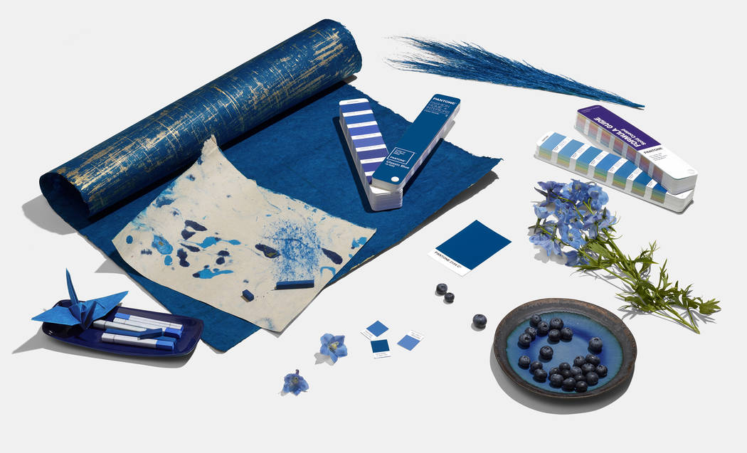
The New Jersey-based company, considered the international authority on color trends, recently selected a shade called Classic Blue as its 2020 color of the year.
“We are living in a time that requires trust and faith,” Leatrice Eiseman, executive director of the Pantone Color Institute, said in a news release. “It is this kind of constancy and confidence that is expressed by … Classic Blue, a solid and dependable blue hue we can always rely on.”
The company promotes it as “a restful color” that “brings a sense of peace and tranquility to the human spirit, offering refuge.”
Las Vegas designer Cary Vogel, of Interiors by Cary Vogel, is a fan.
“It is both classic but still modern,” he said. “It has a fresh and crisp feeling, strong but easy to live with. … It would make a wonderful bedroom (color) paired with white woodwork and balanced with a warm accent color … or in a (home) library paired with warm tones of built-in bookcases and a rich wood floor.”
For nearly four decades, Vogel has styled high-end, luxury residences for clients in Southern Nevada and throughout the nation. He recently completed work on a home in the Summit Club in Summerlin and is currently decorating an apartment on the Upper East Side of New York City, where he also operates a design studio.
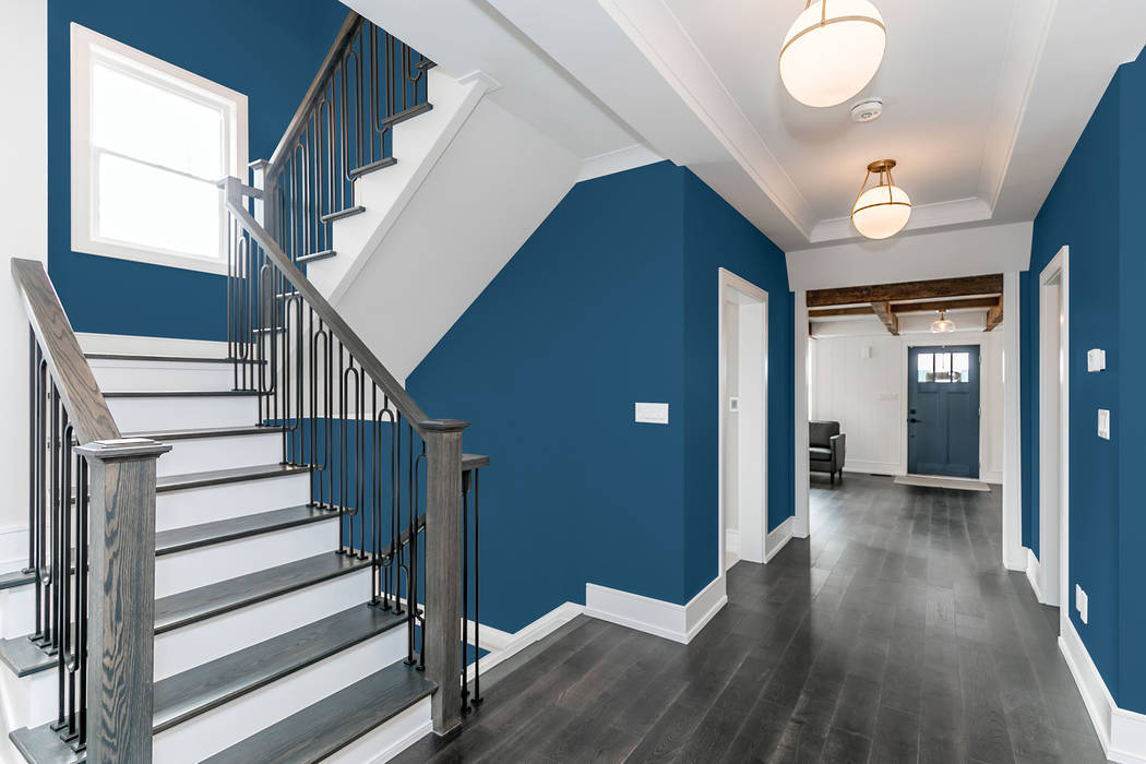
He approved of a few other hues that also received color of the year designations from seven of the nation’s largest paint manufacturers, including Naval by Sherwin-Williams.
Vogel called the dark blue an “approachable neutral. … I think it’s really lovely. That’s a wonderful, deep tone. It’s moody.”
Sue Wadden, director of color marketing for Sherwin-Williams, said Naval is “reminiscent of the night sky, which people have looked to for centuries for guidance, as a muse and as a reminder to live more mindfully.” Also, it “merges the desire for rich, inspiring color with our yearning for relaxation and retreat.”
Vogel also likes First Light, a rosy shade by Benjamin Moore.
Andrea Magno, the company’s director of color marketing and development, said it “reflects a new definition of the home — a shift in mindset from the material to satisfying the core needs in life: community, comfort, security, self-expression, authenticity and, ultimately, optimism.”
Although it is “a flattering color,” Vogel said, “It’s not really a new color. Blush tone has been popular for three or four years already, so I don’t see it as the color for 2020.” Although it may work well in “in a bedroom or a little powder bath … I wouldn’t run it through the house.”
However, another pink called Pale Powder by Valspar (which is manufactured by the Sherwin-Williams Brands Group), failed to win over Vogel. “It’s unexciting,” he said, adding that it isn’t a color his discerning clients would appreciate or request.
It is one of a dozen hues included in a “nature-inspired” palette that serves as Valspar’s colors of the year. Marketing manager Sue Kim said the shades collectively “bring the tranquility of nature and the outdoor world into the home.”
Vogel also does not care for the company’s beigey selection, dubbed Desert Fortress (“It looks like what you’d get from a homebuilder; there’s no thought in that color”), nor a pastel named Utterly Blue. “It’s not a sophisticated shade of blue. … I certainly wouldn’t put it on walls unless it was in a kid’s room.”
The same goes for Minty Fresh by Dunn-Edwards Paints, which color expert and stylist Sara McLean said, “reflects the optimistic spirit of entering a new decade of fresh starts.”
The pale-green shade reminds Vogel of another that was ubiquitous during the 1980s. “It’s just not a pretty color,” he said.
The same goes for Romance by HGTV Home (also manufactured by Sherwin-Williams), a blush that was also popular during that decade. “It looks dated already.”
On the other hand, he calls PPG’s Chinese Porcelain, a deep turquoise, “very classic and timeless. … I always like things that you can’t quite describe in words, that you have to see, and I think that’s this blue.”
PPG senior color manager Dee Schlotter said modern consumers “crave blues like Chinese Porcelain that bring us closer to natural elements such as the sea and sky — creating serenity in any space.”
“It’s very rich” and should pair well with copper, brushed stainless steel and other popular metals, Vogel said. “I think it’s really, really lovely.”
He is also on board with a sage green by Behr called Back to Nature. “I don’t usually specify green for wall paint,” due to its “institutional” connotation, he said. “But I like this color for woodwork, let’s say in a butler’s pantry or a kitchen. A limited dose of it would be very pretty.”
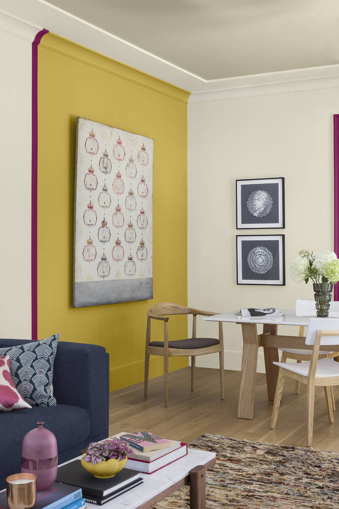
A “brash, brassy yellow” is how the color specialists at Kelly-Moore Paints describe its 2020 pick called Sun God.
“It’s sharp, but … I happen to like those gold tones, and I could see it used on some woodwork in a home that needs an update,” Vogel said. “It’s a very strong, hot color. I could see cooling it down with a deeper blue companioning it or a charcoal.”
The hues selected as colors of the year by paint manufacturers usually fail to influence interior design selections that Vogel makes for his clients.
“I have always been a proponent for classic design. … I want to make sure it is something that’s gonna look just as good five to 10 years down the line,” he said. If a color is “trendy and of the moment, that’s something that’s gonna trickle down to the (big-box) stores, and it just gets diluted and it’s no longer interesting.”